Using the Advanced Dashboard
In the Business Intelligence menu, click Advanced Dashboard.
Setting Up the Dashboard
Using Indicator Cards to Monitor Intra-Organizational Benchmarks
Setting Up and Using a Map Indicator
Embedding a Web Page on the Dashboard
Viewing the Dashboard
Exporting Dashboard Indicators
About the User-Related Gadgets
Setting Up the Dashboard
-
Click  to display the action bar. Unless you are editing the currently displayed view, select the view to edit or click New. You can only edit views that you created, but you can clone shared views to serve as a starting point.
-
If you are editing an existing view, choose Actions»Add Indicator(s); if you are creating a new view, the Add Indicators selection window opens automatically. Select as many indicators as you wish for this dashboard view.
-
To change the name of the dashboard view, choose Actions»Properties. If you have the appropriate permissions, you can share the dashboard with all Cority users or with those in specific roles.
If you have appropriate permissions, you can make a shared dashboard available to users to add to their My Favorites menu. To enable this, once you have created the dashboard choose Actions»Add dashboard to My Favorites Menu. From there you will need to enable it for display on your desired user’s menu configuration or profile’s menu configuration. If the dashboard is later deleted or made non-shared, it will be deleted from all users’ My Favorites to which it has been added. See Customizing Your Menu for information about adding a dashboard to My Favorites, or Managing Menu Configurations for information about adding to a user’s menu or profile.
-
To filter all Data Cube and Query Builder indicators in this view by a GDDLOFB field, click  (beside the dashboard view name) and select the field(s) and the values that you want to filter data by. Note that any values you specify apply to your own view of the dashboard. If you save this view as a shared dashboard, other users who use this view can apply their own filter value but only the dashboard author (and users with dashboard admin permission) can add or remove the fields indicated.
The GDDLOFB filter(s) will be applied to any Data Cube indicators that use the locations as dimensions regardless of whether they are specified as rows or columns in the Data Cube.
-
Resize and rearrange the indicators as you wish. To resize, grab from the bottom right corner and drag to the desired size. To move an indicator, click near the top of it (when it turns into a multi-direction arrow) and drag to the desired location. If you resize an indicator that contains a table, the width of each table cells is resized proportionately.
Indicator option icons are only visible when you hover over an indicator.
-
Edit the contents of an indicator, or the title of a gadget or “other” type indicator, as desired:
-
To select which options to include in a gadget (e.g. which shortcuts to include in My Shortcuts), hover over it and click  .
.
-
To enter the content of a text indicator, click within the dashed rectangle. When you are finished, click outside of the indicator. The text will resize to fit the available space.
This text may be translated in the Phrase Translations list (see Translating Field Labels and Phrases).
-
To change the title, hover over it and click  . Edit as desired and click
  (not applicable on Query Builder or Data Cube type indicators).
-
If enabled in the source query (see the Query Builder Visualize tab.), you can modify the filter criteria of an individual Query Builder indicator. click  (in the indicator toolbar) and select the field(s) and the values that you want to filter data by.
If a GDDLOFB filter is applied to a dashboard view, the Query Builder criteria will be applied to the indicator first, followed by the GDDLOFB filter(s), then by the indicator filter(s).
If an indicator is filtered by a field with a translated label, the label's translation will display in the Filters list and on the indicator's tooltip.
If the query’s criteria changes, you will see an exclamation mark icon in the indicator - click this to apply the new filtering.
-
For indicator cards, the filter icon will display when the source of the “You” measure is a Query Builder report. Any selected filters will be applied to the “You” measure.
-
To remove an indicator, hover over it and click  .
.
Only an administrator or the dashboard creator can edit or remove an indicator or gadget from a dashboard view.
-
Click Save.
You can set up your Cority interface to use an Advanced Dashboard view as your home page; you must first select the view to use and pin it as the default view.
For more information, see Changing the Look of the Interface.
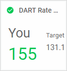
Using Indicator Cards to Monitor Intra-Organizational Benchmarks
Indicator Cards enable you to compare two Query Builder datasets or Data Cube metrics, for example to compare the safety incidents at a particular site to the safety incidents across the entire organization, over the same period.
If you have the Analytics suite, you can view comparisons between your data and the Bureau of Labor Statistics benchmark data (see Comparing Data Against BLS Benchmarks), or use the supporting queries to create indicator cards for your dashboard.
Query Builder reports must use the “Number Only” visual type; Data Cube views must have only one measure in the view. If a Data Cube view returns multiple values, the value at the bottom right of the Data Cube view will be used on the Indicator Card.
-
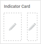
Add an “Indicator Card” indicator (under the Other category) as described above. An empty indicator card is added to the view with two dashed rectangles; you can add a dataset or metric to each.
-
Click in each rectangle to select the Query Builder dataset or Data Cube metric.
-
After you add both elements, you are prompted to configure the upper and lower (above target and below target) bounds and assign the icons that will represent the possible states. For example, if the dataset or metric on the left is considered to be under-performing when the number is 10% below the target, you would make the lower bound 10% and assign the lower bound the red icon.
The default title for the Indicator Card is the name of the dataset or metric selected in the left rectangle, but you can change the title as explained above.
The icon and color indicates if the metric on the left is outperforming, average, or under-performing compared to the target, or if there is no data.
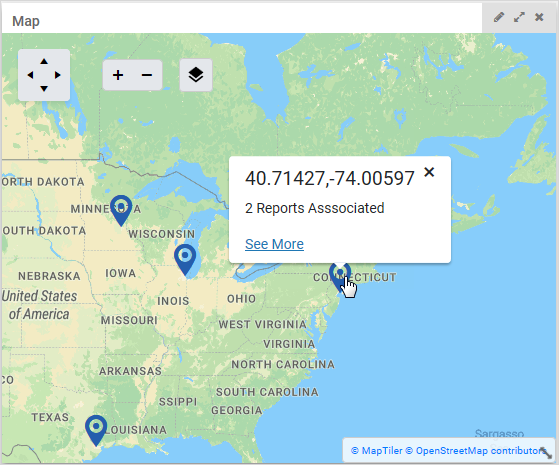
Setting Up and Using a Map Indicator
The map indicator allows you to view any records that have coordinates (such as environmental assets, safety incidents, employee locations or suppliers) plotted on a map. You will be able to click on each map pin to view the number of records at each. If the Query Builder report includes conditional formatting, the map pins will reflect the color as appropriate.
You can plot multiple Query Builder reports on a single map; these appear as separate layers.
To set up a map indicator:
-
The Coordinates field must be added to the layout of the module you want to report on; these include the TreeMasterCode look-up table and the Equipment, Emissions Inventory Source Test Data, Incident, Event Report, and Documents. The Coordinates field may be imported (into a data table, not the TreeMasterCode look-up table) or populated manually in a record by clicking  .
.
-
Set up a Query Builder report that includes a Coordinates field, uses the Map chart type and is a published indicator. Optionally set up conditional formatting for value ranges.
-
On the Advanced Dashboard:
-
Add a “Map” indicator (under the Other category) as described in Setting Up the Dashboard above and save the dashboard.
-
Click on the map to add a layer (a Query Builder report). The selection list includes all dashboard indicators that are based on a Query Builder report that includes the Coordinates field and uses the Map chart type.
-
When you have selected one or more reports, the locations associated with each are displayed on the map.
Viewing data locations:
Click a pin to see a popup of the relevant data. If there is just one report associated with that location, the pop-up will list the report name. If there is more than one report, it will tell you how many there are. In either case, there will be a See More link.
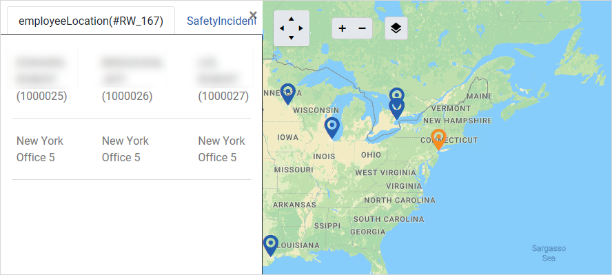
To view the records for that location, click the See More link. The map opens in the full browser window, with the layers shown on the left. If the selected pin is associated with multiple layers, each is shown on a separate tab where you can click a record to open it in its module..
To close the Layers pane and show the map full-screen, click the X in the top right corner of the Layers pane.
To close the map and return to the dashboard, click the X in the top right corner of the map.
Click  on the map to manage the layers: show or hide a layer, view its source, remove it, add a layer, or change the order of multiple layers.
Embedding a Web Page on the Dashboard
The Web Page indicator allows you to embed a web page on your dashboard. The website domain must be approved (“whitelisted”) by your organization (see Whitelisting Website Domains for Dashboard Use). If you set a URL that is not on your organization’s whitelist, the indicator will display an “Invalid URL” warning icon.
The web page must use one of the following URI schemes: http, https, or data. For the data URI scheme, only images can be displayed. For each of these schemes, the following are supported:
-
ports (e.g. "http://mysite.com:2700")
-
user names and passwords (e.g. "https://username:password@mysite.com:30000/directory")
-
internationalized resource identifiers (e.g. "https://en.wiktionary.org/wiki/Ῥόδος")
-
non-internationalized resource identifiers (e.g. "https://en.wiktionary.org/wiki/%E1%BF%AC%CF%8C%CE%B4%CE%BF%CF%82")
-
Add a “Web Page” indicator (under the Other category) as described in Setting Up the Dashboard above and save the dashboard.
-
Click on the indicator to enter the URL for the website that you want to display, then click Set.
-
Resize the indicator as desired; the web page will resize to fit appropriately within the available space.
-
Optionally edit the indicator title.
Viewing the Dashboard
-
To display a different dashboard view, click  to display the action bar, then select the view. This list displays the dashboards that have been granted to your role or granted to all users.
-
If the view is designed with filter fields, the filter icon is orange; click  and select the field values that you want to filter the data by. The filters only apply to Data Cube and Query Builder indicators, and only for your view of this dashboard (i.e. not to other dashboards you can view, and not to other users’view of this dashboard).
If an indicator is filtered by a field with a translated label, the label's translation will display in the Filters list and on the indicator's tooltip.
-
Indicators may include the following options:
-
Click a link (e.g. in Assigned to Me) to open the relevant record/module.
For tables: depending on how it is defined, you may be able to click a table value to open its related record.
-
Click  to view an indicator (except tables) in full screen mode. Click the X or click outside of the full screen to close it.
-
Click  to link to source queries in the Query Builder or Report Writer (depending on your “Default Data Query Tool” system setting) or the Data Cube.
-
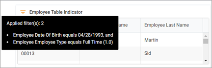
If a filter icon appears to the left of the indicator name, hover over it to view the filter(s) that have been applied, or click the icon to add, remove, or modify the filter(s).
-
Viewing charts:
-
For bar/line/area/point/pie charts originating from the Query Builder: Depending how the chart is defined, you may be able to click a data point to drill through to records. A chart’s data appears blue if there is a drill path, or grey if not (or if you are at the lowest level). Click a data point to drill down; click outside of a data point to go back up. When you get to the records level, if there are multiple records a toggle allows you to navigate through them (may be limited by your security permissions). The drill path and how/if records will open are defined in the Query Builder Visualize tab.
When you drill down on an indicator, to retain the location you drilled to so that it opens at that level automatically for any user who opens the dashboard, save the dashboard. If the drill path is later modified in the Query Builder/Report Writer, the saved drill location will be cleared.
-
For bar, area, and line charts: Click  to view data labels showing the exact values represented in the charts.
-
For line/area/point charts: Click  to enable a linear forecast for a specified projected period. A gray, dashed line representing the forecasted values will display on the indicator, with a marker at each projected data point. The linear forecast only applies to the first level of a drill path. To remove the forecast line, click
  and then click Remove.
-
For bar/line/area/point/stacked charts: Use the mouse wheel to zoom in, then click and drag to view the data presented.
-
For vertical bar, line, area, or stacked charts with a height of four units or more: Click  to display a subchart below the chart. When you click and drag in the subchart, the main chart is zoomed in to show the selection.
-
For circular indicators originating from the Query Builder: The color used is based on where the data falls in relation to an upper or lower boundary; these are defined in the Query Builder Visualize tab.
-
Viewing tables:
-
The indicator title is the same as the source Data Cube view or Query Builder table, and the table looks the same as it does in the source.
-
If the content exceeds the dimensions of the data table, a vertical and/or horizontal scroll bar will appear allowing you to scroll to see additional data.
-
If a data table contains child records, click the Expand icon next to the parent record to display the child records.
-
If the data table contains invalid data, an ! icon will be displayed.
-
Site and role security will be applied to data tables from Query Builder.
Exporting Dashboard Indicators
There are several options to save charts or tables for external use:
-
To save a chart indicator as an image, right-click on the indicator and choose the appropriate save option (varies by browser).
-
To save all indicators, click  to display the action bar, then choose Actions»Export to PDF or Actions»Export to Excel. You are prompted to save any changes prior to exporting. The resulting file is named with the title of the dashboard, and each indicator appears on a separate page/worksheet as an image or table as applicable. PDF images are hyperlinked to the current dashboard in Cority.
Gadgets are not included in an export.
If a chart is defined with a drill path, the exported chart is displayed at the top grouping level.
Excel has a maximum worksheet length of 31 characters - any indicator names that exceed this length will be truncated when exported to Excel.
If you need to export the dashboard regularly, set up the export in the Report Scheduler (see Scheduling Reports).
-
To print a layout of all indicators, click  to display the action bar, then choose Actions»Print. The indicators appear on a new tab where you can adjust the layout according to how you want the printed report to look; note that any changes you make here are for print use only and are not reflected on the actual dashboard.
-
Select the page size and orientation (this must match the browser’s print settings).
-
Move or resize indicators.
-
Control what is shown in an indicator: zoom in or out, scroll, or show or hide the data labels.
Click  when you are ready to print.
About the User-Related Gadgets
The following “gadgets” are available for use in Advanced Dashboard views:
|
Assigned To Me
|
Lists all outstanding corrective actions, pending incident investigations, metrics and questionnaires that have not yet been completed, Quality tasks (such as nonconformances, complaints, CAPAs, FMEAs), change requests, equipment due for calibration/testing/inspection, and due/upcoming/overdue inspections and surveys. Edit the indicator to exclude any of these types. The icons are shaded green for records due in the future, yellow for records currently due, and orange for overdue records.
|
|
Calendar View
|
View up to five calendar views that your role has permission to view. The views are available in a dropdown box. Each view can be assigned a different color to help differentiate entries if you choose the default “View All” consolidated calendar view.
|
|
My Conversations
|
This is an instant messaging gadget to be used to quickly contact other users, for example, if you have a question about a particular workflow or record status.
The indicator displays the Cority users in your organization. Online users are displayed first, followed by offline users, and they are further ordered as follows: most recent to least recent unread message followed by most recent to least recent conversation.
Click a user to start a conversation with that person.
|
|
My Favorite Reports
|
Lists your favorite ten reports (those starred in the Reports or Query Builder list views) in the order you last used them, from most recent to least recent.
|
|
My Favorites
|
Lists the modules you identified as your “favorites” via Personalize this menu.
|
|
My Recently Reviewed Records
|
Lists the last ten records you viewed in the order that you viewed them, from the following modules only: Clinic Visit, Case, Incident, Event Reporting, Findings & Actions, Risk Assessments/JHA, Audits & Inspections, Monitoring (including Noise) and Surveys.
|
|
My Shortcuts
|
Can be configured to list shortcuts to various Cority workflows (new event, new clinic visit, new finding & action, new waste manifest, import monitoring samples, import respirator fit test results, import clinical testing results, etc.). Edit the indicator to select from the shortcuts provided.
|
|
My Views
|
Can be configured to list shortcuts to any standard, custom, virtual, or look-up table list view or Advanced Dashboard view that has been granted to your role. Views in this gadget display in your specified language.
. Click  to select from the available views. Each shortcut can be assigned an icon and/or a color. to select from the available views. Each shortcut can be assigned an icon and/or a color.
Note The gadget does not support the older Dashboard module views, or tab (sublist) views that are linked to a specific record (for example, the Injuries/Illnesses tab on a particular incident).
|
|
Safety Culture Score
|
Displays the Safety Culture Score for your organization (see Understanding the Safety Culture Score). This score is recalculated weekly.
|