– Administrator function –
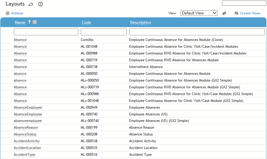
The Layouts list shows all form layouts in the application, with the exception of custom forms such as Scheduling. There are two classes of layouts: Cority default and user-created (custom). Cority default layouts are bundled with the application and cannot be modified; these are identified on the layout with the Cority Created check box selected. User-created layouts are created by users with administrative rights; these are identified on the layout with the Cority Created check box cleared.
An administrator can import and export layout configurations; see Importing or Exporting Layouts or Migrating Configurations.
There are some forms which require the use of a single specific layout. Whenever this is the case, the layout can be configured through system settings. If a form is not restricted to a single layout you can create multiple layouts for it and assign them to roles for use.
A layout may include an image, such as a workflow diagram (see Including an Image on a Layout).
Cority default
layouts are pre-defined. To override a default layout, create a custom
layout and assign it to the user's role. The Layout drop-down list will
include all layouts for the current form assigned to the logged in user's
roles.
Changes to the eRx Employee Medication layout are strongly discouraged:
In order for an ePrescription to be transmitted successfully, Surescripts
requires specific fields on the layout to be populated correctly. If any
of the required information is missing or if the required workflow is
altered, the eRx functionality may not work.
Creating a Split Screen Layout
Including an Image on a Layout
Importing or Exporting Layouts
In the Administrator menu, click Layouts.
Click on a form name, then click New to create a custom version of the layout.
Clicking New will erase the Selected Fields list. If you want to start your custom layout with the same configuration as the current layout, choose Actions»Clone instead.
On the Form tab, define general information about the form as well as managing the subsections and fields that will be on the form:
Enter the Code and Description for the form.
Enter the Tab name, which is used for the first tab label in display mode.
To hide the Layouts drop-down in display mode, select Hide Layout Selector. To exclude this layout from the drop-down, select Inactive.
To include a workflow banner at the top of the form, select the Workflow (see Displaying Workflow Steps on a Layout).
To include a custom tab, select the UDF Form questionnaire that has been set up for that purpose and flagged as a UDF Form (see Creating a Custom Tab). The questionnaire will be associated to the layout but will only be displayed if UDF Form Display Mode = “Tab”
To show an icon beside the layout name when the user clicks New in a form, select the User Icon (from the UserIcon look-up table). The “Enable Layout Workflow” system setting must also be enabled.
Normally child records are navigated via arrows at the top of the form; if you prefer that child records be selected via a drop-down, select the Toggle Related Forms as a Drop Down check box.
To make the fonts about 30% larger, select Larger Fonts. The change is roughly equivalent to increasing from 11pt to 15pt.
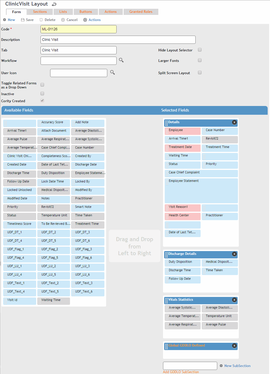
To create a new subsection, enter the subsection header in the field next to New SubSection, then click the button. To edit a subsection’s properties, double-click the subsection header bar; you can change the following:
The Name of the subsection
Whether the subsection should appear Expanded by default
How many Columns should the fields in the subsection be arranged in
Optionally, set a condition that
will control whether the subsection is visible or not; for
example, the “Visit Details” subsection will be visible to
the user unless the Department field
on the main record equals “Management”, or the “Letters” subsection
will be hidden from the user unless the “Completeness Score”
on the main record is greater than 50. You can only create
one condition per subsection/tab.
You can also set the condition of an employee or user field
to “Is Me”; in this case the subsection will only be displayed
when the field value equals the employee/user filling in the
form.
This functionality is not available for Cority-created (default)
layouts, or for the GDDLOFB subsection.
For information about including a GDDLOFB subsection, see Defining GDDLO Sections.
Drag fields, one at a time, from the
Available Fields box to the desired subsection. To drag fields
and subsections, click the dotted bar on the left hand side.

Once a field is placed it is disabled (grayed out) in the Available Fields list. However, the blank field (top-left corner of the Available Fields box) is never disabled -- it serves as a placeholder field for alignment purposes or for entering custom text (for more information, see Setting Up An Organizational Tree).
Any system-required fields (shown with a pink background) will already be included in the Details subsection and can be moved between subsections. They cannot be removed, but can be defined as Disabled in the field properties; these fields are enabled (and mandatory) when a user is creating a new record, and are then disabled after the record is saved, in effect creating a read-only layout.
To rearrange subsections, drag and drop the subsection header within the Selected Fields box. To delete a subsection, click the x in the top-right corner of the subsection header. A subsection cannot be deleted if there are required fields in it.
Click Save.
You can include a user-defined field and change its properties to have its Source linked to any existing data table or look-up table. This is currently only available for custom Travel Clearance and Travel Destination layouts.
Configure the fields. Double-click on a selected field and define its properties:
Property Name |
Non-modifiable used to identify the field by the application. |
Label |
Field's label. This allows you to change the meaning of the particular field on the form. This is NOT a translation. If you rename the field, the new name will then appear in the form translation. Translation uses this label to translate this label for the field to other languages. Renaming a field on one layout will cascade to all other layouts for the same form. |
Tooltip |
Optional; add a tooltip that will appear when a user hovers over the field. |
Required |
Select if this is a required field. This checkbox is always selected (and disabled) for system-required fields. User-required fields are shown in the Selected Fields list with a yellow background. |
Disabled |
Select to temporarily disable the field (preventing entry). This checkbox is always cleared (and disabled) for system-required fields. Disabled fields are shown in the Selected Fields list with a gray background. |
Disable Autofill |
For non-picklist fields, select to prevent the browser from autofilling the field. For picklist fields, autofill is disabled by default and cannot be enabled. The browser will autofill First Name and Last Name regardless of their autofill setting. |
Hide Lookup Selector Icon |
Select to hide the look-up selector icon that normally appears beside look-up fields. For example, you may not want users to be able to view the entire list of Employees. |
Column span |
Number of columns the field will occupy (1 or 2). |
Row span |
Number of rows the field will occupy. Default is 1. Depending on the field type, maximum is 1 for look-up fields and 10 for text fields. |
Label Alignment |
The alignment for the field's label (Left/Center/Right) |
Default value |
The default value of the field. This depends on the type of field: • Check box fields - select or clear the check box to represent the default state. • Picklist field - select a value from the look-up table. • Free text field - enter free text that the field should show by default. • Date field - click Current Date to default to the current date when user creates a record, select a particular date or leave blank. • Drop-down list - select a value or leave blank. • Employee or User field - to have the field default to the employee/user filling in the form, click Is Me. The default health center identified in a form’s layout will only be used if a user has not specified a Default Health Center in their system settings. Default field values may be superseded by values set in system settings or by workflow; for example, the name of the EHS person in an incident report is populated based on workflow criteria, regardless if a default value is defined in the form layout. |
Display values as radio buttons Number of columns when displaying values as radio buttons |
Display the first 50 values of look-up fields as radio buttons (instead of having to select from a list) in the number of columns specified. |
Enable Multiple Values |
For picklist fields, will present each value with a check box and allow users to select multiple values. Notes
If you select both “Display values as radio buttons” and “Enable
Multiple Values”, the “Display values as radio buttons” setting
takes precedence. |
Use the Sections tab to include any related forms, which are rendered as tabs after the main tab on the form. These forms may have already been defined with their own layout.
Drag an item from the Available list to the Selected list. To rearrange the order of selected items, drag and drop within the selected box.
To select the layout of the section, double-click the section. You can select New to create a new form layout for that section, or select an existing form layout. Click Close.
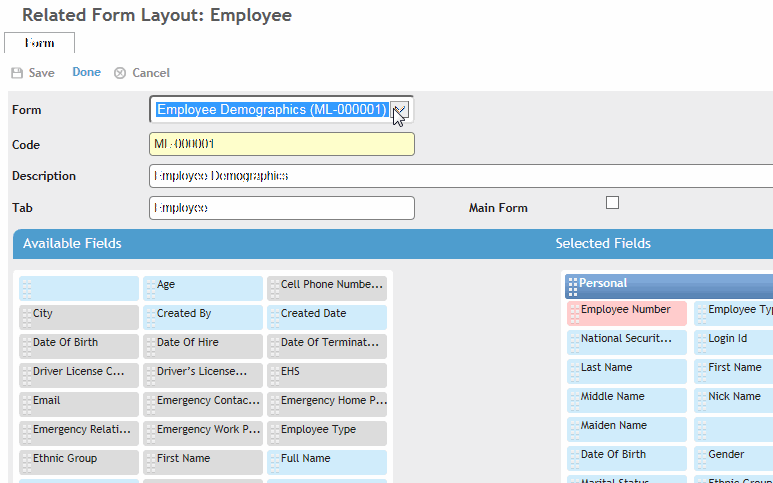
Click Save.
Alternatively, create a custom tab based on a questionnaire; see Creating a Custom Tab.
Use the Lists tab to include any related lists, which are rendered as tabs after the main tab (and any related sections/form tabs) on the form.
A list can be configured to appear as a section on the main tab instead.
Drag an item from the Available list to the Selected list. To rearrange the order of selected items, drag and drop within the selected box.
Double-click a selected list to configure it:
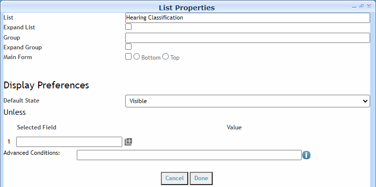
The List will be the tab label (or the section label, if the list is grouped with another list).
If the list should be loaded when the main form loads, select Expand List (by default a related list is not loaded until its tab is clicked).
If multiple lists should be shown on the same tab, enter the same Group name in each list’s configuration. The Group name will be the tab label. Related lists with grouping will have the group name inside square brackets.
To expand the group to show which lists are in the group,select
Expand Group. The lists themselves
will not be expanded unless Expand List
is also selected
If you want the list to appear as a section on the main tab instead of as a separate tab, select the Main Form check box, and indicate if it should be included at the Bottom or Top of the main form.
Optionally, set a condition that will
control whether the list is visible or not; for example, the “Visit
Details” list will be visible to the user unless the Department field
on the main record equals “Management”, or the “Letters” list
will be hidden from the user unless the “Completeness Score” on
the main record is greater than 50. You can only create one condition
per list.
You can also set the condition of an employee or user field to
“Is Me”; in this case the list will only be displayed when the
field value equals the employee/user filling in the form.
This functionality is not available for Cority-created (default)
layouts.
Click Done.
Click Save.
On the Buttons tab, select which buttons will be available on the form. The standard buttons (New, Save, Delete, Cancel) are selected by default.
Drag an item from the Available list to the Selected list. To rearrange the order of selected items, drag and drop within the selected box.
Click Save.
On the Actions tab, select which actions will be available on the form.
Drag an item from the Available list to the Selected list. To rearrange the order of selected items, drag and drop within the selected box.
To create an action that will trigger a business rule, drag the New Action item from the Available list to the Selected list, then double-click on it to open the action properties. Enter a name for the action in the Button Label field, and select the Business Rule; only rules that match the layout entity will be available.
To present the action as a button instead of in the Actions menu of the form, double-click on the selected action and select the Display as Button check box; optionally change the Button Label. The button will display to the right of the standard layout buttons. You can add up to four action buttons to a custom layout.
Click Save.
Depending on business logic, some actions and buttons may be disabled.
On the Granted Roles tab, select which user roles are allowed to access the form.
Click the add icon, select all applicable roles, then click Select.
Do not click New to add a role; the New button will start a new form layout.
Click Save.
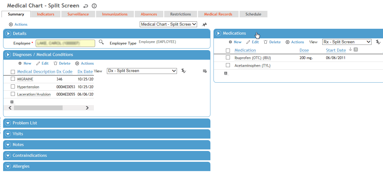
You can view multiple lists on the form’s main page without having to switch to another tab or scroll down.
Create the layout as described above.
On the Form tab, select the Split Screen Layout check box.
On the List tab, change the properties of the appropriate selected list(s) to attach it to the main form, and select whether it should appear on the top or the bottom, and left or right column. If multiple selected lists share the same Group (as identified by the group name displayed inside square brackets), they must all be assigned to the main form.
When you edit or create a record with this layout, you will see the additional list sections above (or below) the main form. In the following example, several sections are below the main form.
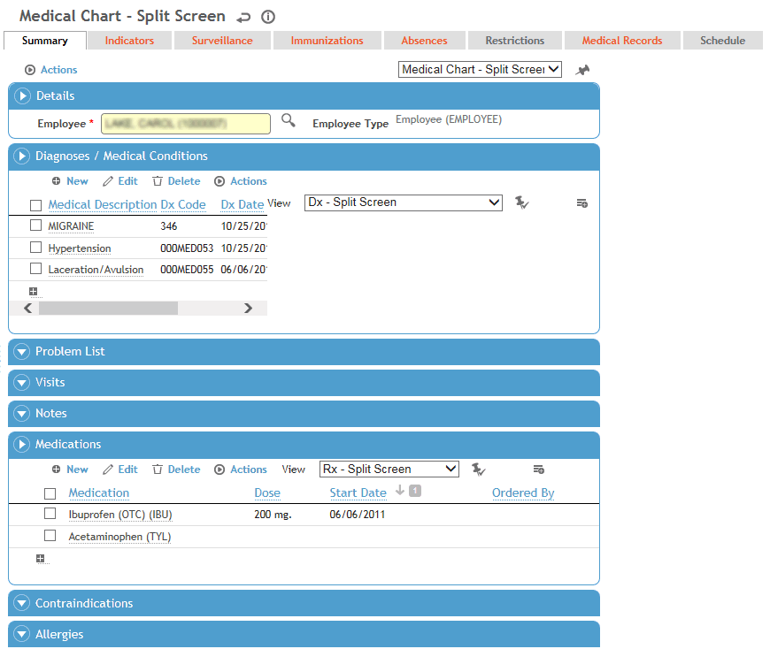
You can edit or create records directly in a section of a split screen layout without having to open the source module.
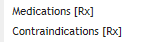
Drag the title bar of the sections to another area of the screen to suit your purposes. In our example, we have moved the Medications section to the top right side.
You can include an image file, e.g. a workflow diagram, that will appear on each use of a custom form layout.
Drag a blank field from the Available Fields box to the Selected Fields box.
Double-click on the blank field in the Selected Fields box to define the Field Properties:
Click Browse to retrieve the image.
Change the Column Span and Row Span to define the relative size for the image; regardless of the values selected, the image will retain its aspect ratio.
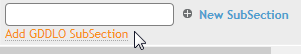
Many forms require a GDDLO subsection. If it makes sense to the layout you are working on, there is an orange link at the bottom of the Form tab to Add GDDLO Subsection.
If you have previously defined the global GDDLO subsection for all forms (via Actions), when you click the orange link it adds a subsection titled “Global GDDLO Defined” but doesn't show the fields.
All layouts that include this Global GDDLO
Defined subsection will be updated whenever you edit via Actions»Define/Edit
GDDLO subsection for all forms on any
layout.
To have a field default to the “Default Value” selection if it is left
blank, select the Always Apply Default Value
When Blank check box.
If you want to have a custom GDDLO subsection, you have to first click the orange link (to add the global subsection) then choose Actions»Define/Edit GDDLO subsection for this form to override the section and view/move the fields.
If you want to change a custom GDDLO subsection to match the global GDDLO subsections, you must delete it, then click the orange link to add the global subsection.
If you want a GDDLO field to display its entire lineage, in its Field Properties in the layout select the Show Lineage check box. You may want to also change the Column Span to 2 to accommodate the extra information.
You can create a questionnaire that adds multiple user-defined fields to a layout, and include the questionnaire as a tab on that layout. It will be displayed to the right of the main tab. The Questionnaire Description will be used as the tab label (up to 25 characters). The tab will be in edit mode (unless the main record is locked). Users can choose the Edit Flex Fields action to go to the questionnaire in the Questionnaire look-up table, or Print Flex Fields (similar to printing a questionnaire). The header will display the current date, questionnaire name, and GDDLOFB from the parent record.
A questionnaire on a custom tab does not support attaching documents, comments, scoring, child questions, or creating findings.
To add a questionnaire as a custom tab to the layout:
Set up the questionnaire as desired; the questionnaire must use a custom layout that includes the Flex Fields check box so that the questionnaire may be identified for that purpose.
In the layout of the form to which you want to add the custom tab, select the questionnaire in the Flex Fields field on the Form tab.
In the Flex Fields Display Mode field, select Tab, otherwise the tab will be hidden on the layout.
You may import a layout from or to a JSON file. The file contains the following fields:
Code
Description
Tab
User Icon
Toggle Related Forms as a Drop Down
Inactive
Hide Layout Selector
Larger Fonts
Split Screen Layout
Selected Fields (including their Field Properties)
Selected Sections
Selected Lists (including their List Properties)
Selected Buttons
Selected Actions
Selected Granted Roles
To import a layout configuration, in the layout list view choose Actions»Import Layout Configurations. Indicate whether any existing layout configurations should be updated, then select the JSON file.
To export a layout configuration, select the layout(s) in the list view that you want to export, then choose Actions»Export Layout Configurations.
An administrator can also migrate layouts from one environment to another; see Migrating Configurations.